Please share your opinions and expertise since we need all the help we can get!

Sunday, July 28, 2013

Curtain Poll: Your Turn to Play

My mom ("grandmom") offered to make us curtains for the nursery, which is really exciting since there are not too many curtain choices out there that we like. So we walked around the aisles of Joann Fabric to see what struck our fancy. I came back with a yard each of four different fabrics and now I'd like your help deciding which to choose. Time for my readers - all 5 of you - to give me your opinions! Take a look at the four choices below and then fill out the poll at the end of this post. If none of them speak to you, choose "other" and let me know a different design that you think would be perfect. The nice thing about using fabric instead of ready-made curtains is how many more choices there are. So if you can describe it, it probably exists.

We haven't begun to deal with style of curtain and whatever we choose will have a backing to block some of the light (but not all of the light - don't want baby to only be able to sleep in a pitch black room), so don't consider those two things when picking.

The choices:

1. Yellow with a very subtle white design on it (mostly invisible from far away)
2. Pink and brown elephants against a blue background
3. Blue and green elephants on a white background
4. Yellow and white stripes
Here they all are again, in close up:


See anything you like?

Which fabric for our nursery curtains?
Yellow with white pattern
Pink and brown elephants on blue
Green and blue elephants on white
Yellow and white stripes
Other (please leave a comment)
free poll

Monday, July 22, 2013

A promising start

I got over my fear of messing up our freshly painted walls and finally got started. The semi-gloss has other ideas, however, and is proving its effectiveness. It would seem that it's so resistant to marking that it is nearly impossible to paint over top of it. But I'm stubborn and wouldn't let a little thing like that stop me. I used the brown right out of the can and just slapped it on for coat number one. Without any other tones, it looked so flat. The green was still visible through the brown and the brush strokes were there (a symptom of painting onto the glossy wall). On the other hand, it was easy to wipe away mistakes quickly.
An hour of watching paint dry (actually, of watching TV downstairs) and I was back up for a second coat. This time, I mixed the brown with beiges and grays, to give it more depth. The second coat also created much better coverage. I'm not sure if this picture captures the difference between using one color versus several - the top branch and trunk already got the layered treatment, but the bottom branch has not - it looks much more boring and 2-dimensional.
I decided to hold off on getting on a ladder to do the green foliage, since I was home along, so I turned next to Mr. Parrot. I had to do the same double coat, slapping on the primary colors once for coverage (and, since I had bits of white and gray on Ms. Giraffe on the right, you'll see I put down the first layer of her eye and tongue, making for a rather ghostly scene).
Another hour or so and then it was time for some textured feathers. You can see that I added in some orange, tinted some with white, added red to the blue and vice versa. Nothing particularly crazy, no shadowing or realistic texture, but I think it's a good compromise for a cartoonish look.
I was wrapping up the parrot when D came home to admire my work. He also suggested something incredibly obvious and yet so ingenious - if one coat wasn't adhering to the paint, why not prime first? And so I present to you my primed giraffe. That was where I called it quits for the day, so I don't know if it will help. But after seeing how poorly the yellow, more than any other color, covered up the green, even two yellow coats after priming will be better than what I would have faced without the white background.
(Don't look too closely at the fabric in the window - that's for the next post. I know, I know - "don't look" is a surefire way to make you look, even if you didn't look at it the first time.)

Tuesday, July 16, 2013

Jungle Fever

No no, not that kind of jungle fever. I mentioned that we were going for a jungle theme in the nursery and even though the colors are already definitely beginning to evoke a jungle look, that wasn't good enough for our baby! My plan, from even before we were expecting, was to make an attempt at a mural. The room already had one before we painted over it, so the idea was in our heads right from the start:
We've always liked the idea of wall decor and even have this vinyl up in our bedroom:
I didn't want to do a vinyl in the baby's room. First, because it was a huge pain to apply, with having to carefully push out all the air bubbles for such an intricate design, and second because they can be peeled off and if we had any decals low to the ground or otherwise in reach, what two-year-old wouldn't want to pull them off the wall and try to eat them.

So painting was the best choice. I'm no stranger to painting - way back in high school I actually liked art, and have plenty of not-too-horrible acrylic on canvas paintings to prove it. In fact, I even helped paint a mural on a wall of a store once, so this should theoretically be right up my alley.

First step, find inspiration. Not a problem thanks to the internet:


(Now you're starting to see why the green backdrop?)

Second step, figure out which walls to work on (and since we don't have furniture yet, I had to think ahead to where the furniture will likely go to avoid painting something and then covering it up with a wardrobe or chair) and sketch out a design. Notice the random notebook page? Yeah, that's because I drew this while in a meeting at work...nothing like multitasking!

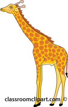
Third, find some fun characters as more specific inspiration. I was going for cartoon, not realism, so I needed the internet to help yet again:


And a late addition (not in the original sketch) to fill out the wall with the window:

(Yes, I realize that giraffes don't live in the jungle with monkeys, but search for cartoon jungle animals and you get all kinds of not-quite-geographically accurate ideas. And you know what? It's for a baby, so whatever.)

Third, (and this is the most incredible, though it is kinda cheating) - have a friend offer to loan you her projector, which will let you project the pictures directly from your computer screen onto the wall so you can trace them in pencil and create an outline:
I had to fiddle with the furniture height and distance from wall to get the design exactly where and what size I wanted it:
 There's Mr. Monkey, on the wall for me to trace:
 Ta-dah! Can you see it on there? It's pretty light but the pencil lines are definitely in place:
Repeat that with the parrot and the giraffe (oh, and of course there's a tree but I free-handed that) and you have a complete mural ready to go.

The last thing stopping me was paint availability. I needed quantities greater than you can buy in an art tube but less than the gallon or even quart that they sell at most paint stores. And paint samples usually use sub-par paint. So I spend about a week strategically planning how to make the mural with minimal colors (thank you, basic understanding of mixing paints) and a trip to my parents to raid their used paint collection, before hitting Home Depot to pick up three 1-quart cans of Behr Premium Plus Ultra (way cheaper than our Sherwin William's default and didn't seem too bad): yellow, dark brown, and dark green (Flame Yellow, Ancient Root, and Pine Scent, to be specific). Between those, some free samples of Valspar's summer palette I got from Lowes thanks to some coupons in a magazine, and the other colors I have around the house, I should theoretically be able to get everything I need.

So why can't I get started painting?

Friday, July 12, 2013

It's not easy being green...

I set you up last time with a bit of a trick. We did go with green, but we didn't go with either of the colors we sampled. Lime Rickey (the top) was a little too yellow for our liking. Witty Green (the bottom) was the right tone but we worried that it would look too much like mint or pastel and not like jungle. So we did a very scary thing. We went to the store undecided and bought a color without trying it first. We almost picked one that turned out to be even more yellow than Lime Rickey (we didn't think it was particularly yellow looking on the paint chip, but the required base for the paint was actually a yellow base, so that scared us off). Then we decided that since we liked Witty Green but didn't like how pastel it was, we would just get the next one down on the chart.

And so, I bring you....Laudable Lime.
You can see that we did slap some up next to the other wall swatches, but by then really we had committed to two full un-returnable gallons, so it was mostly a formality. So with that, we started getting to work - as usual, I did the edging and D did the rolling.

The non-right angle edges were tough, just like they were in our bedroom. Last time, I used Frog Tape to block off the lines. But that was hard in itself to line up the tape with the line between the wall and the ceiling. This time I opted to free hand the line. It made for some awkward angles for me, but actually came out just as neat (or as messy, depending on your point of view) as with the tape.

A note on the paint - since we started painting this place 3.5 years ago, we've been primarily using Sherwin William's Duration. It used to be their top of the line paint, and we've been mostly happy with it. I don't think it is quite as durable at getting rid of stains and marks as they make it sound, but it's been good. Since the last time we did a major paint job over a year ago, SW came out with a new top of the line paint, pushing Duration down one peg. And while they probably are almost identical and we probably couldn't notice any real difference, Emerald did have one main selling point - absolutely no VOCs. Duration has very low amounts, which again, is pretty good. But since I was painting while pregnant (and yes, we did this before it got too hot, so we kept the windows open), we opted to spend a little extra and get everything we could with no VOCs at all, including Emerald. Also unlike in most of the house where we used eggshell finish on the walls and satin on the woodwork, we opted for semi-gloss everywhere, because it's even more durable and more washable. Which is something we thought would be pretty important for a little kid's room.

And so, I present to you the very, very green room (after it was all done, we realize it might be a teensy weensy bit too bright):

Think we're done? Oh no, we're just getting started on this room. Wait until you see what we have planned next!

Sunday, July 7, 2013

The Extra Room Gets a Purpose

The extra room was primed and ready to go....I think I can stop the show of just calling it the "extra room" when I show you the color palette we were considering:
Yes, that's right. There's really only one explanation for a set of colors like that - the "extra room" is a future nursery! For a future member of the family joining us sometime in November. We knew that we wanted a jungle theme for the room, nice and gender neutral. So we wanted green walls and, as a special touch, a light blue ceiling. I have wanted clouds on my ceiling since I was literally five years old, so now was my chance to get them.

We started, as we always do, with trying a few different options (well, almost always - the one time we didn't, we hated the color so much we started over).

We sampled Sherwin Williams Lime Rickey (top) and Witty Green (bottom). As you can see from these pictures, we tried to put it up on every wall at every angle, to see how it would look in different lights.

We also got to work on the ceiling. We chose a very subtle blue, Aviary Blue, in SuperPaint because it was one of the few paints that Sherwin Williams offers in a flat finish, to hide the imperfections of the ceiling. The blue is almost too subtle for my taste. It might make the white of the clouds hard to see. But it sure beats the yellow ceiling that we covered up.

As usual, I did all the cutting in and D rolled. We're a good team. For the ceiling, I didn't have to worry about being careful, since a much darker color was going to go on the walls, so it was a fast job. In fact, we did the priming and ceiling in just one day (it's taking me longer to get around to blogging it than it did to paint, so that's pretty good).

One more update until the color reveal. But I think it's a safe bet to guess the right answer is "green."