The contract is ratified and the first check signed and we are about to break ground on this addition but we still haven't gotten everything figured out. Today, I thought I'd talk about our siding and how the house will look from the outside, and get your thoughts on some color options.
Two years ago as you may remember, we got new siding, swapping narrow white aluminum strips with wider gray Hardie board. Since we have no hope of matching our existing brick to a new addition and we can't afford a slate roof on it, we're deliberately not attempting to match the exterior with a "close-but-no-cigar" approach (brick that isn't quite the same color, shingles that imitate slate but not exactly). We're reflecting this also in the overall style of the addition, by using a modified shed roof instead of a gabled roof, which is a more modern style than our existing house. I already posted about our planned standing seam roof last fall. So the siding is also going in a different direction than our existing house. Literally. While our current siding runs horizontally, the new addition is going to feature vertical board and batten style siding, which relies on wide boards joined with narrow battens (see explanation of this here). You've already seen it in the pictures I posted of our blueprints.
For this board and batten, D had a lot of strong opinions about the various widths of each line, which are written into our plans. The batten will be narrow--1.75 inches--and the 4-feet wide boards will get decorative battens along them, in addition to the ones at the ends that join the separate boards. Here's are two view from our plans that show the interplay between existing and new facade:
We're planning to use Nichiha brand, after D did extensive research and found they had some benefits including durability and cost. And we can choose a custom color paint for the same price as a pre-painted Hardie board, which is nice. But that's where the first complication arises. We can choose ANY color.
We originally thought we'd like to use Prussian Blue from the Benjamin Moore Williamsburg collection (second from the bottom, third column):
Or Moscow Midnight from Sherwin Williams, for some inscrutable tranquility, whatever that means:
Then we worried--is adjusting every OTHER aspect of the exterior already enough? Should we stick to the same gray color as the rest of our siding? At first, we were planning to use a lighter roof color and worried that we did not want the roof and siding grays to be (almost) identical. But now we're leaning towards a darker gray roof (after verifying that it would not be less energy efficient), so the light gray of our existing house would be fine on our addition as well. This is the only view from off the property of the addition, where the mix of the two styles will be most visible, for context:
.jpeg)
Second complication--we decided that to supplement the board and batten design on the addition (and because D has always hated the way the sunroom upgrade looks from the outside), we're going to replace the existing rectangles (circled in red below) with the vertical board and batten. The question then becomes would it match the existing house's gray or the addition's blue (if we went with the blue)?
The only thing that will definitely change if the addition goes blue is the front door--I would definitely repaint that to match.
So what do you think? Go with the blue because it's more fun and we like it and it will help distinguish the new space as something different? Or go with the gray to match our existing house and have at least one unifying element?
A few other updates as we move into our construction phase--
All our drawing include casement windows, but we changed our mind and going with double-hung. I prefer the way they open, I like that they are consistent with the existing house, and I think having the screens on the outside is preferable since we have two indoor cats with very sharp claws.
We've already made one of the only purchases that we have to provide to the contract, with delivery scheduled for next week--our IKEA
PAX wardrobe system frames, which will sit in the garage until they need to be assembled. We had a nagging fear that they would be out of stock when we needed them because, well, IKEA.
We think we've picked out our toilet (going big with
Toto Nexus washlet+) and I think we've reached a good place with our tiles thanks to the help of our reader(s):
Along the back are the three colors of the textured subway tile. Lowe's only showed it in the gray but Home Depot listed
five colors! But it turned out we liked the gray best anyway (bianco is too cream colored, which you can see set off against the white backsplash of our kitchen) and the azurro is too dark to use as more than an accent. So our current plan is to use the gray (sorry, no, they go British-style by calling it grey) with the cobalt penny tiles in the shower and the flower hexagons for the floor.
We have no idea what paint color to use, anywhere. Picking a bedroom color especially feels like a lot of pressure. I usually opt for muted blues and greens but D suggested this bold rose color,
pressed flower:
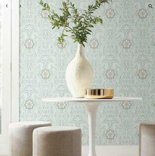
We also have no idea what light fixtures we want or if we want to do wallpaper anywhere. I think wallpaper behind the powder room sink would be nice, and possibly the wall behind our bed. But the choices seem overwhelming!
Send your ideas! Send help! Send alcohol! We break ground Monday!


.jpeg)


