Please share your opinions and expertise since we need all the help we can get!
Showing posts with label countertop. Show all posts

Friday, June 21, 2019

And it was all yellow

It turns out that construction paper, when wet, is great at transferring dye. It makes sense, in retrospect, but definitely was not something I would have thought about when my kids went for a cup of water while coloring last weekend. But oh yes, there is quite a lot of dye in that paper. An hour after said coloring, we walked into the sunroom and see sopping wet construction paper on the wood floor. We life it and see...
Now this would be bad in any instance, but you may remember the saga over the floors in this room and how we fought hard to make it look perfect. And in an instant, two small children had ruined our efforts. OK, I'm being a bit melodramatic - I know it will sand out if we ever were to refinish the floors, but that is most definitely not on the horizon.

Various websites provide options of varying degrees of confidence. Both of us agree that Magic Eraser seems like a bad idea, since it actually sands away some of the finish. So we opt first for a vinegar solution and a cloth. That removes a lot of the blue and a small amount of the yellow. Next, it's on to a baking soda solution. I have to warn you, keeping a consistent white balance with these pictures was pretty much impossible, so you'll have to use your imagination a bit to compare between pictures.
Even with something as gentle as baking soda, instructions across several websites seem to suggest that gently rubbing it, rather than aggressively scrubbing it, was the way to go. Even baking soda could pull off some of the shine. So we put some elbow grease into it for a while.
 And in the end? Well, you tell me. What do you see? Here's the "finished" picture, from two angles (and evidently two very different light sources?).

Do you see it? We do. It's a lot better but the yellow is still there lurking. We're hoping that no one else will ever notice it and that, with time, neither will we. Our wood floors are generally a honey color, so maybe it will just look like variation in the wood. Or we might go back and take another stab at it with something more aggressive. Do you have any ideas? We've read so many things on the internet that we'd prefer to try something that one of you, dear reader(s) has actually successfully used in a similar situation.

We were surprised that a color as light as yellow lasted more than the blue, until D reminded me about the constant problems we're dealing with on our counter when I make my new favorite drink, a golden milk latte. Getting turmeric on the counters keeps requiring me to pull out the big guns of a countertop cleaner, rather than just our normal dish soap and water. I didn't take a picture because I didn't want to let the color sit for even a moment longer than I needed to, once I realized that I'd gotten some on the counter (I usually make my drink on the stove, AWAY from the new counter). Not that we think turmeric is the source for yellow in construction paper, but who knows...

Until then, well, we're feeling a little yellow.

Tuesday, July 17, 2018

My Kitchen Mood Board

Let's just pretend we don't still have an asbestos problem in our basement and move on to more fun topics - KITCHEN! This is a close to a mood board as I'm getting, since I don't really do those. So here's how it is shaping up.

Despite the strong outpouring of support for our previous choice of Peppercorn White, I couldn't leave well enough alone and commit. So we went to a countertop supply center to have a look around. There was no shortage of stuff to look at:

We even got to dress up in hot pink hard hats, because this was a factory where they were actually lifting, moving, and cutting stone. OK, so they also had yellow hats, but where's the fun in that?
When I saw it, I knew it was love:
76, Rolling Fog. Definitely more my style. Here's a big view of Peppercorn White, for comparison, number 15:
As I feared, the larger sample looked so much busier than I wanted. I feel like this was the same sensation I experienced after sampling a bunch of greens in the nursery only to paint it a color that turned out to be incredibly LOUD! We took home some more samples (I briefly considered taking home enough samples to make a coaster set, only to realize the edges were probably too sharp to be considered child-safe). Rolling Fog is all the way on the right and Peppercorn White is the top left. The middle row is Mara Blanca, also a choice that we liked, but a tad too boring.
And so, with that, we committed whole-heartedly. And now, onto other choices we've made for the kitchen. We solved the issue on making our backsplash interesting without being *too* interesting by choosing a subway tile style with some subtle texture, Highland Park by MSI (the same people who make our quartz counter) in whisper white. And again, for something a little interesting, we've asked our tile installer to put them together like this - hopefully it works out well:
We're still undecided on our dining room accent light, mostly because D and I seem to have conflicting opinions. He like the kind of hanging pendants with an old-fashioned-looking lightbulb with exposed filament (they're all LEDs by now, so it's totally fake). I like elegant chandeliers, which, admittedly, might look out of place with our decor. I'm willing to compromise with pendants that use textured glass (I suggested mercury glass, but D wasn't a fan). So here are the current contenders, in order from his preference to mine (literally - our choices run exactly opposite each other):
West Elm Sculptural Glass

Pottery Barn McCarthy

Pottery Barn Paxton

Pottery Barn Arden Crystal Chandelier
For knobs and pulls, we're using some pretty standard looking brushed nickel ones from Home Depot. We still have to commit to a paint color but we're going to go with some very similar to what we have now, so if we don't get out to pick up some paint swatches, we'll just have the painter color-match it.

And with that, we're off! First payment paid and first day of work scheduled for Friday!

Sunday, June 17, 2018

Decisions, decisions

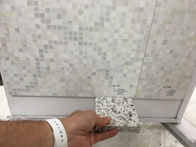
We're still making decisions about our kitchen but mostly we're making decisions about who to hire to do our kitchen. The first company* to come out has been insistent that he can't give us an estimate until we pick our counter and tile. We thought we had our counter but found a couple more enticing options on the website and asked to see a few that had not been brought over to us (specifically Rolling Fog and Pelican White, if you're keeping track). But the counter person has not been particularly responsive, so in an effort to keep moving, we took our borrowed Peppercorn White sample to the tile store that had been recommended to us and got to work.

See anything you like? After walking around a few larger displays (thanks to IKEA, among other things), we know that we like offset tiles, like subway tile patterning, rather than tiles that line up vertically. We don't like the tiny decorative glass ones that we loved so much when designing an accent tile in our bathroom. We think they would be too busy in our kitchen. We do, however, seem to like some kind of texture or pattern more than just plain white subway tiles. So here are some options we're considering.

This one is probably *too* textured, but it was kind of cool.


Too much Turkish sauna-vibe maybe? 
We like it! But would it be too busy for a full backsplash?

Hard to tell from the picture but it's sort of iridescent.

For this one, we like the wavy pattern on top, but in the white just below it.
 
In the meantime, a second company* came out and more reasonably told us he would give us some baseline prices in a few days, taking into account our general counter and tile preferences. We plan to push back on company 1 to insist on the same. When we asked to see the additional two counter options, he said we would have to travel about 30 miles to the counter store and pick which one we liked definitively before he could give us prices. Now, I understand that our selection impacts price. But wasting a Saturday to pick out countertops before we even pick out our installer seems a bit much to task. We may have to move down to company 3* and drop 1 before they get very far.


*I'm using "company" as shorthand but in reality, most of these people are just single contractors who then subcontract out the counter and do all the installation of the rest by themselves.

Wednesday, June 6, 2018

Counter-point

Counter guy came today with some samples in the white to gray color scheme we were thinking of. It wasn't Silestone brand, but a similar (and cheaper) quartz composite, MSI Q Quartz. We're doing some reading to find out if it's comparable, but a quick look seems to suggest it should be just fine.

Here's the whole layout he brought. Right off the bat, we were able to eliminate the two solid colors (5 and 8, in the main row) and the brownish ones (2 and the one up higher than the rest).
 That left the cooler grays and whites.

The guy took plenty of measurements, and noted that our sink might cause a problem. Apparently it's cast iron and very heavy, and he believe's it's being held up with a frame for support, and not simply fitted in with an under-mount, because the caulking structure wouldn't hold it up. This will affect the fine tuning counter measurements. He said that if we decide to go with this contractor, he would need to remove the sink and take the final precise measurements of the hole before the counter is fully cut, to make it fit perfectly. He also suggested a different alternative - a new, stainless sink. Trade cast iron for steel? No way. I didn't realize it was cast iron but it makes sense - it's super sturdy and cleans up well, and it is spacious and wonderful. And apparently it is a Kohler K5834. Thank goodness for phone camera reaching into strange places - here is the underside of the sink, from inside the cabinet.
For now, we will worry about those logistics later. We're still in the estimate stage of the game, though we have yet to find a second person/company we have wanted to invite out to give us one. We usually rely on neighbor recommendations and the kitchen remodeler seems to be a sparsely populated category, at least for the (low) level of remodeling we intend to do.

So in any case, today we considered our counter options. It may be hard to tell from this picture but we have them sort of arranged light to dark with a similar rock pattern on the bottom "row" (I use the term pretty loosely here - we were in a rush to take photos). We also liked the smoother marbling of the two on the top with the solid in between. What's your favorite? Scroll down to see what we picked (though it's still not too late to change our mind of course, so please share your favorite). 
The middle one on the bottom was our winner. We thought the one to its left was too monotone, though we did like how much it would potentially lighten our room. The one on the right (askew in the picture) was too similar to the color we currently have and, while we love the darker grays, thought it would close the room in too much. And the quartz pattern in that row looks, we think, more natural and actually set with embedded stones.
So "White Peppercorn" is the winner (probably). Though now that we have a new countertop brand, I'm tempted to peruse the website and select all manner of choices beyond the 10 or so samples that he brought. What do you think?

Sunday, May 18, 2014

Magical Corian

About a month ago, I did this to the counter:
We weren't entirely sure what kind of counter we had, and I was almost certain the previous owners said it was Silestone. But it turned out that looking up at the underside of the counter from inside the cupboards revealed a label and we have Corian in "Midnight." That still didn't help us know what to do though yet again the care instructions make it sound invincible (or certainly invincible to an essential oil which, I confirmed, would merely cause mild irritation to the skin at full concentration).

So, for a while, we did nothing. And that may be the best thing to be doing. Just going about our normal business, here is the same spot as of yesterday, in different lighting:


I tried deliberately to choose angles and lighting where the ring was most dramatic, so you can see it has faded significantly. Not a clue why or how. Are we somehow re-adding oils? Orange oil is a known cleaning product so maybe the essential oil just "overly cleaned" the counter and now it is becoming shiny with grease? Regardless, it looks like if we continue to ignore this problem, it will go away on its own. For once, benign neglect seems to be the way to go (now if only that same strategy worked with our yard...).