Please share your opinions and expertise since we need all the help we can get!

Saturday, March 9, 2024

A Solid Foundation, Continued

There wasn't much to report this week due to rain that kept the work crews away some days and hid any progress under a tarp on other days. On Tuesday, I got a small peek at the newly parged foundation when the tarp blew off, plus there was a hint at the middle pillar sticking up in the middle. And that was really all until yesterday.
Uncovered for the weekend, here's the finished foundation, with gravel French drains (and crawl space) and black waterproofing coating: 
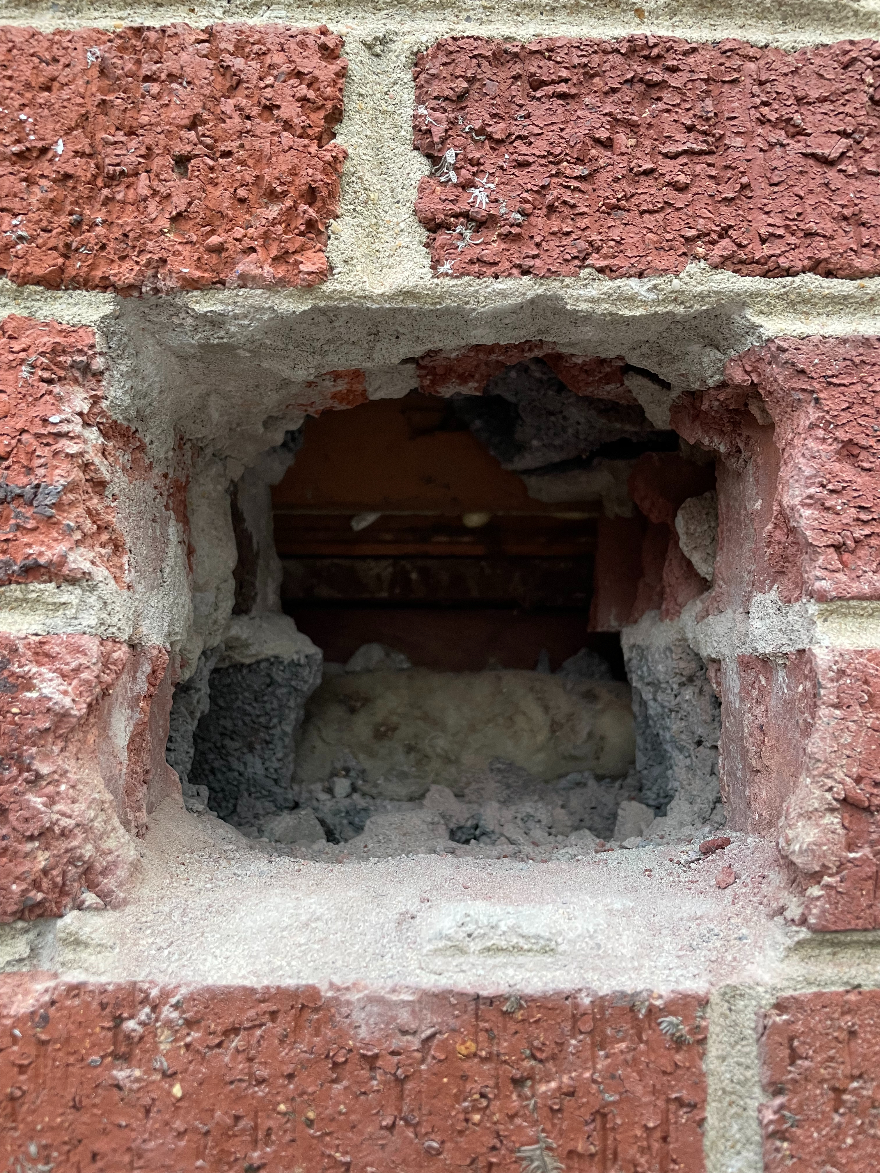
This week they also broke through to our crawl space (the big boarded up square on our house) after--the previous week--drilling a small hole to our office to make sure the floor level was lined up (the tiny square under the office window that I though had been filled in with cement but was actually a sponge--yes, a sponge).
So of course we had to remove the sponge and take a look. This hole goes all the way through the expanding spray foam that D sprayed under the baseboards years ago, with a small glimpse of our floor board. We can't really see this hole from the inside, but clearly it's just past the part of the wall/floor that we can see.

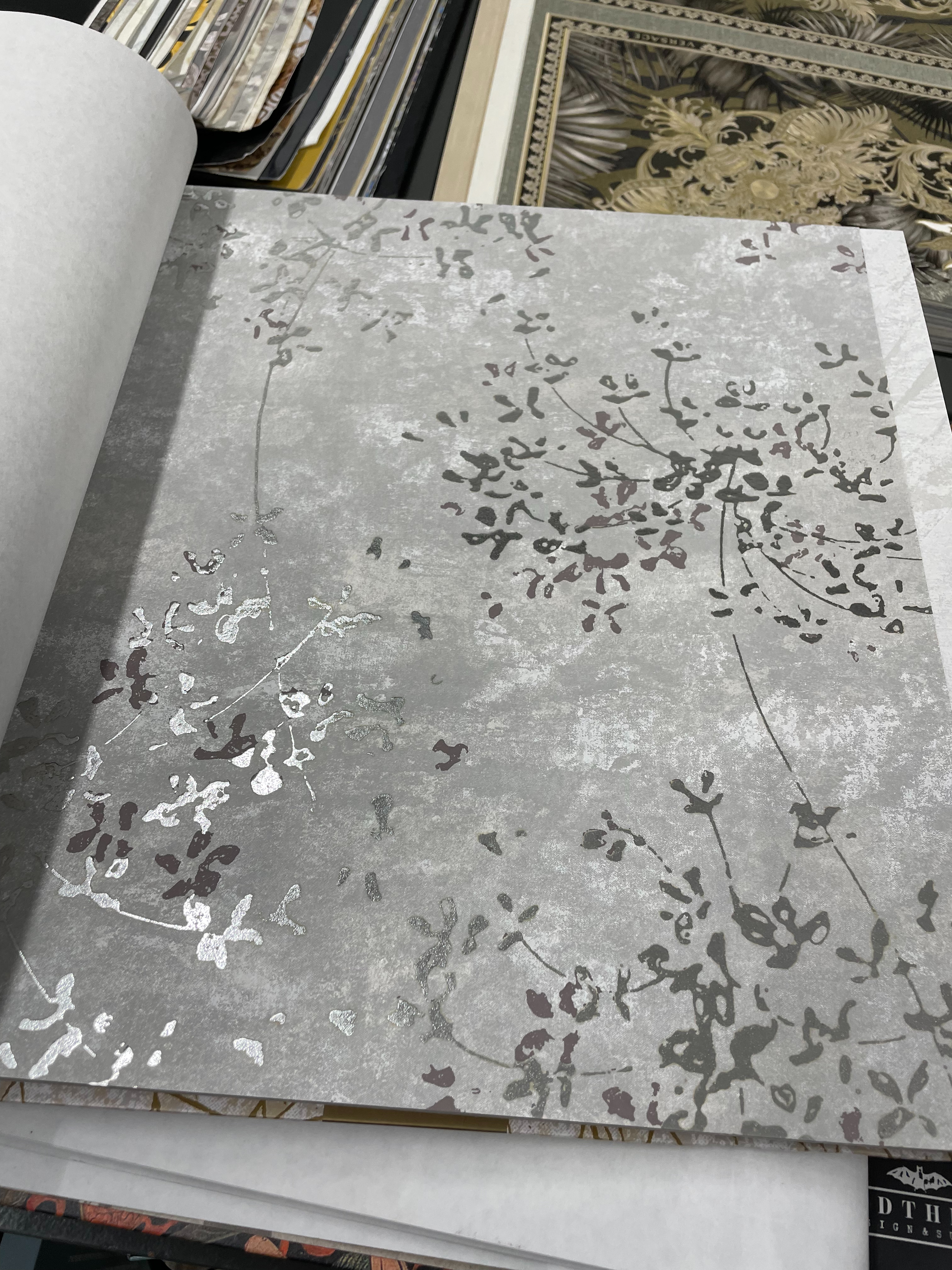
So while the addition chills out for the weekend and awaits framing, let's talk about wallpaper. We made some significant progress this week, and I think we've decided on what we want in our bedroom. First we narrowed it down to two similar designs, neither of which are ones I posted about last time. Both are metallic this time, which was a priority, and both are in neutral tones which do not actually help me pick a paint color.

The first is A-Street Prints Arian. If it's not clear from the picture, the vaguely dandelion-looking things are silver and the rest is a watercolor/speckled background of a beige-gray (but more gray than beige, so I like it).

Here's the "in-use" photo, and I love that they're using birch furniture, because we're planning to as well.
The second wallpaper is York Wall Coverings Luminous Branches, which looks a little more like spring blooms on branches instead of dandelions and the background is a little more solid, but otherwise is remarkably the same:
You can see from this "in-use" photo that it's a bit more vertical and a little less random feeling. This picture below also makes it look significantly more beige, but that could be the white balance or surrounding walls too.

Compared to each other, Arian is a little more gray and scattered, and Luminous Branches is a bit more beige and consistent. D liked the consistency of the background but finally came around to Arian as our number one choice. And while it doesn't help us decide on a wall color at all, the watercolor effect will solve another problem we were trying to figure out: what color to paint the ceiling. Neither of us wanted a bright optic white and we went back and forth on color drenching (matching the ceiling--AND the trim AND the decor together) or using a lighter version of the wall color. Now I think we'll opt for the lightest greige of the wallpaper.

So we solved one problem, though the other three walls are a different story. Still leaning towards a bold blue or plum though.

Excited for the framing next week!


Tuesday, February 27, 2024

A Solid Foundation (Days 1 and 2)

The start of a project is always so dramatic compared to the finishing touches later in the process. This giant one is no exception. 

The day started off with a lot of spray paint and some panic on my part that "it's so small" followed by "it's using up so much of the yard" (which is, therefore, probably the right footprint for this addition):

(Excuse the screen outline--I was trying to take the photo without being too noticeable to avoid being creepy.)

By the end of yesterday (day 1), we had what one of my children referred to as A MOAT!

A team of at least 8 people dug this trench and the footer holes, both of which are about 3-feet deep, by hand all day yesterday, which is pretty incredible. They had to take out a couple of small trees too. Busy day! They disconnected our downspouts and cut the underground connections too. A lot of work for day 1.

Today made less progress but looked equally grueling. Our trenches got rebar pieces and the crew manually carried in a ton (possibly literally) of concrete and cinderblock:

We also got a porta-potty delivery, which I think you probably do not need a picture of.

Next is...wait--just until tomorrow thank goodness--for what is apparently the first inspection. The crew covered everything up in a rather dramatic GIGANTIC tarp to keep it all dry and called it quits early.


While the crew is doing manual labor, D and I continue to work on aesthetics. Your comments were so helpful on deciding house color that I think we'll opt to match the gray (paired with the charcoal roof), though we're probably going to opt for a darker gray on the parged concrete base. We've also been hard at work on interior decor. We have started to look at wallpaper...

I was raised in a time when wallpaper was discolored tiny flowers that you couldn't wait to remove from the wall, but really wanted to explore some of the bolder designs that are now available, and we have found so many that we like. Since we haven't decided on paint/accent colors yet, picking a wallpaper seems like a good next step to deciding what complimenting colors to use for paint. Here are a few of the patterns we're considering for the wall behind our bed:

Gatsby Damask
Sprigs
Cabaret
Since it's hard to see the pattern on the wall, here's a close up. Do I really want a wallpaper called "cabaret" in the bedroom? Probably not in theory. But we are leaning towards painting the walls a bold color and are seriously considering deep greenish blue, so this would certainly make a great accent for it:
Clearly I have a blue thing going, even though I didn't start out with that goal in mind (though most of our house is painted in blues, greens, and grays, so this isn't surprising). I'm drawn to paper that has a metallic or textured feel, probably because that helps distinguish it from just a painted mural, but in the end, only one of these is actually metallic. So I might opt for these or I might just keep looking. It does seem like finding just one will be the bigger problem.

(Bathroom wallpaper inspiration coming in a future post.)

Feel free to share your thoughts on any of these or on wallpaper in general. Your opinions have all been really helpful!


Saturday, February 24, 2024

Go Time!

The contract is ratified and the first check signed and we are about to break ground on this addition but we still haven't gotten everything figured out. Today, I thought I'd talk about our siding and how the house will look from the outside, and get your thoughts on some color options.

Two years ago as you may remember, we got new siding, swapping narrow white aluminum strips with wider gray Hardie board. Since we have no hope of matching our existing brick to a new addition and we can't afford a slate roof on it, we're deliberately not attempting to match the exterior with a "close-but-no-cigar" approach (brick that isn't quite the same color, shingles that imitate slate but not exactly). We're reflecting this also in the overall style of the addition, by using a modified shed roof instead of a gabled roof, which is a more modern style than our existing house. I already posted about our planned standing seam roof last fall. So the siding is also going in a different direction than our existing house. Literally. While our current siding runs horizontally, the new addition is going to feature vertical board and batten style siding, which relies on wide boards joined with narrow battens (see explanation of this here). You've already seen it in the pictures I posted of our blueprints.

For this board and batten, D had a lot of strong opinions about the various widths of each line, which are written into our plans. The batten will be narrow--1.75 inches--and the 4-feet wide boards will get decorative battens along them, in addition to the ones at the ends that join the separate boards. Here's are two view from our plans that show the interplay between existing and new facade:


We're planning to use Nichiha brand, after D did extensive research and found they had some benefits including durability and cost. And we can choose a custom color paint for the same price as a pre-painted Hardie board, which is nice. But that's where the first complication arises. We can choose ANY color.

We originally thought we'd like to use Prussian Blue from the Benjamin Moore Williamsburg collection (second from the bottom, third column):


Or Moscow Midnight from Sherwin Williams, for some inscrutable tranquility, whatever that means:

Then we worried--is adjusting every OTHER aspect of the exterior already enough? Should we stick to the same gray color as the rest of our siding? At first, we were planning to use a lighter roof color and worried that we did not want the roof and siding grays to be (almost) identical. But now we're leaning towards a darker gray roof (after verifying that it would not be less energy efficient), so the light gray of our existing house would be fine on our addition as well. This is the only view from off the property of the addition, where the mix of the two styles will be most visible, for context:


Second complication--we decided that to supplement the board and batten design on the addition (and because D has always hated the way the sunroom upgrade looks from the outside), we're going to replace the existing rectangles (circled in red below) with the vertical board and batten. The question then becomes would it match the existing house's gray or the addition's blue (if we went with the blue)?
The only thing that will definitely change if the addition goes blue is the front door--I would definitely repaint that to match.

So what do you think? Go with the blue because it's more fun and we like it and it will help distinguish the new space as something different? Or go with the gray to match our existing house and have at least one unifying element?

A few other updates as we move into our construction phase--

All our drawing include casement windows, but we changed our mind and going with double-hung. I prefer the way they open, I like that they are consistent with the existing house, and I think having the screens on the outside is preferable since we have two indoor cats with very sharp claws.

We've already made one of the only purchases that we have to provide to the contract, with delivery scheduled for next week--our IKEA PAX wardrobe system frames, which will sit in the garage until they need to be assembled. We had a nagging fear that they would be out of stock when we needed them because, well, IKEA.

We think we've picked out our toilet (going big with Toto Nexus washlet+) and I think we've reached a good place with our tiles thanks to the help of our reader(s):
Along the back are the three colors of the textured subway tile. Lowe's only showed it in the gray but Home Depot listed five colors! But it turned out we liked the gray best anyway (bianco is too cream colored, which you can see set off against the white backsplash of our kitchen) and the azurro is too dark to use as more than an accent. So our current plan is to use the gray (sorry, no, they go British-style by calling it grey) with the cobalt penny tiles in the shower and the flower hexagons for the floor.

We have no idea what paint color to use, anywhere. Picking a bedroom color especially feels like a lot of pressure. I usually opt for muted blues and greens but D suggested this bold rose color, pressed flower:
We also have no idea what light fixtures we want or if we want to do wallpaper anywhere. I think wallpaper behind the powder room sink would be nice, and possibly the wall behind our bed. But the choices seem overwhelming!

Send your ideas! Send help! Send alcohol! We break ground Monday!


Sunday, January 21, 2024

Tiles and toilets and vanities, oh my!

To say that we're spending a lot of time decorating our future bathroom would be an understatement. This is not our first bathroom rodeo, so we're hoping some of what we learned upstairs will apply to the new room. Because of that, we know 1) don't trust the contractor when you say you want gray tiles and he insists that the tiles you think are beige will "read gray" (they won't--I always look at that room and think "this is greige at best--why did I agree to this?") and 2) don't spend lots of money on a custom vanity that isn't much better than a pre-fab one. There's also 3) don't skimp on faucets and shower heads - get the ones with metal parts is something that our upstairs bathroom contractor taught us, and we are forever grateful. The fourth thing we learned--don't skimp on the bathtub--doesn't really apply since we have a shower.

So tile. There are SO many choices. This time, we have a bigger budget than in 2012, but it's not infinite. We're trying to stay with $8/sq. foot, so of course my favorite tile, which we saw in-person when some family remodeled their house, appears to cost about $28/sq foot. Oops.

Fortunately, we have lots of others that we like too. This one highlights some of the star elements from the above tiles (similar styles can also be found that is white stars against a black background):

This subway tile has really cool varied patterns:

I really love this tile along the back wall, and like how it's using three different tiles to create the whole scene, but I have no idea what it is (and, let's face it, it's probably out of our price range):
We're also still trying to decide how to integrate different tiles into our space. Personally, I look at a tile and immediately judge whether it makes sense for floor or wall, though I couldn't actually say why I think that. So we figure we'll choose one busier tile and one simpler tile and whichever space gets which (floor vs. wall) will depend on the tile itself.

Right now, this is our current favorite:
While pictures show it as going anywhere, to me, it definitely screams "floor." I like it because D mostly sees three dimensional cubes and I mostly see flowers. Meanwhile the actual tile is a hex shape. There's a black and white version too, which D prefers, but I want my gray bathroom (and the black and white reminds me too much of our existing 1950s bathroom).

If did that floor, we'd probably want a simpler wall (though I *really* like the patterned subway tiles and I'd be sad to lose them). And to keep the room feeling big, probably in a light color. Here's a porcelain "marble-like" tile that we think has a good amount (i.e. not a lot) of veins that is pretty simple (and cheap, yay!). It also comes in different sizes, which I feel like would be good so we could use bigger tiles for the shower seat. I think? We really feel confused about what would look good where. I keep wondering whether it would make sense to use only the "marble" for the shower (including the floor) or use the hex tiles for the floor even in the shower. Suggestions welcome!
Finally (maybe? unless you see a missed opportunity to integrate even more different tiles?), I think we'd like to do something more colorful/whimsical for our shampoo/conditioner cut-out in the shower. What do you think of these blue scallops?

Why blue? Well it's one of our favorite colors to decorate with and also, we're seriously considering a blue vanity and want to choose another color element to compliment it. Here's an idea of what we're thinking as our vanity:

Obviously wherever we can, we'll want to order samples so we can see how all these elements match in real life. We're also nervous to order a prefab vanity from Wayfair, though we're trying to use pictures of the insides of the drawers to choose ones that appear to use wood elements and dovetail construction, instead of just plastic/MDF:
We're also considering some beautiful pieces like this, which obviously will add to the cost but will let us pick out our own sinks (all the Wayfair vanities we're looking at are undermount sinks, and that's fine but it would be nice to at least consider others) and top:

D like midcentury modern so much more than I do. I like some good trim (apparently I like "Shaker" cabinet doors). Also--and I know this seems strange, the wood ones remind me of the cheap "wood" vanities I've had in almost every apartment I've ever lived in, so they end up feeling cheaper than the painted ones.

Whatever vanity we get, we know we want it on legs (but not floating--we like legs) and we want the whole floor tiled, so it wouldn't be the end of the world if we replaced it at some point, say if we get the cheaper Wayfair ones and realize we made an error a few years later.

Ok, you'll note that this already very long post hasn't touched on the powder room at all. Well that's because most of the decisions we make here will apply to that room too. We want the floor to match, and we plan to use our simple wall tiles as the baseboard (no other wall tile needed there). We haven't really looked into sinks because we know we want a very simple, small design and don't much care beyond that. The one thing that will class up the powder closet is...the toilet!

We haven't actually figured out exactly what model we want, but we know (ok, *I* know--D doesn't really care) that we want a Toto Washlet, which has a warm water bidet and (maybe? probably?) a heated seat. It doesn't need to play music or whatever the top end of the line includes, but it will not be cheap. It also includes making sure that we have electricity running to the toilet. This will probably need to be its own post but at least putting it here for a placeholder.

Please tell me your thoughts. I feel like I'm dreaming bathroom designs these days...and this doesn't even address light fixtures and other things we'll need!

Friday, January 19, 2024

The Hyphen

Ok we're getting very close to actually starting this project, so I better hurry up and blog the plans. Today, the hyphen! The hyphen is everything in the corridor that joins the existing house to the new bedroom. The architects call that section "the hyphen" and we like the term for it - it's the dash between two separate spaces (since I want a big bathroom, maybe I should  think of it as an "em" dash instead of a hyphen... yes I'm a grammar nerd). 

Very early ideas from the architect included altering our existing office and making it into a bathroom, but we already knew we wanted as little changed in our current home as possible, so I won't even show you those drawings. The first acceptable plan was this one:

You can see that past the brick walls of our home, the architect put a pretty traditional double-vanity bathroom to the right and a walk-in closet to the left. Nothing too exciting, but nothing problematic either. We were bummed to lose our existing bathroom window though (above the existing toilet, now covered by the walls of our new bathroom). We also went back and forth on whether we really needed two sinks (answer: no, but probably the next owner would, and actually they would be cheaper and more standard than getting a custom single-vanity for the large space). Otherwise, nothing really changed in this hyphen for a very long time, even as we tweaked the bedroom design. It didn't seem like there was much we *could* do. There's a bathroom and a closet, and we had a mostly fixed amount of space (and I wanted a relatively large shower). I also wanted a soaking tub but that seemed pretty unrealistic with our footprint.

But THEN, our summer brainstorming led us to move the walk-in closet behind the bed as a corridor, into the main rectangle of the bedroom and that freed up tons of possibilities for the left side of the hyphen. We decided that we wanted to go Euro style and separate the toilet from the rest of the bathroom. This would also allow us to shrink the right-side bathroom to where we wouldn't lose the window AND avoid having to relocate our existing HVAC. Yay! Then it was a matter of adjusting the layout to something that would feel comfortable and not too cramped.

This option creates a *very* small powder room (or WC, except since it has a sink I'm not really sure what the proper term is) with no window, and we worried it would feel claustrophobic. The door structure was also a little awkward, forcing us to enter a closet before entering the toilet area.


This one lays out the powder room with a window, though we lose a closet. The entry makes a lot more sense though, coming off the hallway rather than through a closet, but we worried it was excessively long and would look rather strange.


Using our "expertise" at CAD rendering, we made this suggestion to the architects:

Also not pictured, we proposed moving the doors to what is called the linen closet so that it opened into the powder room, since what you can't see here is that there are stairs to enter the hallway where it meets the existing house, so it made the door and shelving quite awkward. In the end, here is what we ended up with deciding on:

You'll see that the shower and vanity flip-flopped walls in order to make sure the two (now pocket) doors were in alignment, and we're strongly considering a steam shower (still researching, but it's in the plans). Our new layout has a powder room with open shelving and a closed linen closet on one side of the hyphen, and a double-vanity and sizable shower (possibly to include steam) on the other. This is all done without losing our existing window or HVAC (though we'll need a new unit to condition the addition, as you can see in this picture).

Now as we start to approach a contract and construction, it's time to talk products and mood boards, or whatever. Next time, tiles and vanities!


Wednesday, December 27, 2023

The Bedroom

A bedroom is really just a simple box. How hard can that be to design, you might ask. Well, it turns out that when designing the bedroom of a primary suite, it can be pretty darn hard. Here's the journey we took to arrive at our final bedroom design, from beginning to "approved permit" (YES! We have a permit!). There are quite a lot of fuzzy screenshots here, but I figured they were sufficient enough that you could get the idea.

First, after hearing our ask, the architect proposed three designs with different bed positions. I hadn't really thought about it before since we've always moved into a previously built home, but I suppose the bed position really is the key starting point to a bedroom. Especially when it's a king size bed, which ours will be (we are SO excited for that upgrade - soon there will be plenty of room for us AND the cats). So to orient yourself, the top of each picture is the back fence line of our yard (north-facing). The right faces out to our patio and the left to a currently empty lot that may one day be something more and which is the view of our house you get approaching up our street.

This look was nice, but we though having a wall with no windows on one of our more public walls might look weird architecturally:

This felt like some awkward wasted space in the entry way:

This one seemed ok, but that's a lot of windows looking out to a space that could end up being who-knows-what.

The verdict from that exercise was that we knew we wanted our bed to be against the wall that is depicted here on the left, facing out to our patio. Next, we considered storage and sitting space. We briefly toyed with some options that would create a picture window or pop-out. With a few different mock-ups (only one shown here), we quickly realized it would overcomplicate the design and really affect different exterior options. We also decided we want to have wardrobes in the room rather than a walk-in closet, something like the IKEA PAX system, but with the addition of some architectural accents and drywall to make them look fully built-in.


We also added in a couple windows back to the left wall. We felt these would be small enough to not be terrible if whatever ends up on the lot is something we don't want to look at, but still help the exterior look and provide a little light.

And that was the state of the room when we paused the project last spring, which gave us all summer to think more about it. After some discussions with some very design-savvy family, we came back to the project this fall with a new proposal that involved putting the bed on a partial wall with the PAX built-ins behind it. So the whole area behind the bed is essentially a really giant walk-in closet (though the cabinets will still have doors also). We started out with four full-size units like this:

But quickly realized that the partial wall had to line up with our entry door or it would look like you're walking into a wall, so that created a narrower corridor and the need to have thinner shelving on one side:

Then we played with adding a window or two back in, first one in the center:
And then one at each end, which we liked better because it would send some light into the main room as well. We also lengthened the entire room just a little bit to allow for enough space on the partial wall for normal-sized nightstands. Also during this process, we came up with a cool way to use some of the space to add another PAX unit immediately to the left of the entry. This will make more sense when I get to the "hyphen" post (the architects have been calling that corridor with the bathroom on it the "hyphen").


And...that's really it. We made an additional tweak once the detailed, more precise drawings came in, when we realized that a third full-size PAX unit would fit against the wall, and we figured out (at least tentatively/for the permitting and for the contractor bidding), where the electrical stuff would go. Here's the final drawing:

We really like how we will look out over the biggest part of our yard (and the space we're most in control of), how we have a wall of north-facing windows that should provide some lovely even light, and how we have a cool area of storage that is separate enough from the bedroom to give us a more open-feeling room. You can see from the parallel dotted lines where the highest part of our ceiling will be, which I think will also feel very spacious as it continues to rise past the bed. Having a floor-to-ceiling wall behind the bed that doesn't connect to any walls feels like a bold move that made me a little nervous, but now I'm already planning how to make that into a really cool accent wall, maybe even with a pop of wallpaper (though we don't even know what color we want the room painted, so that obviously has to come first!).